How to Build a Successful Visual Identity for a Kidswear Brand
How to Build a Successful Visual Identity for a Kidswear Brand (Colors, Design, and First Impression)
After choosing a strong name for your kidswear brand, the next and most important stage begins: turning that name into something that can be seen, felt, and remembered.
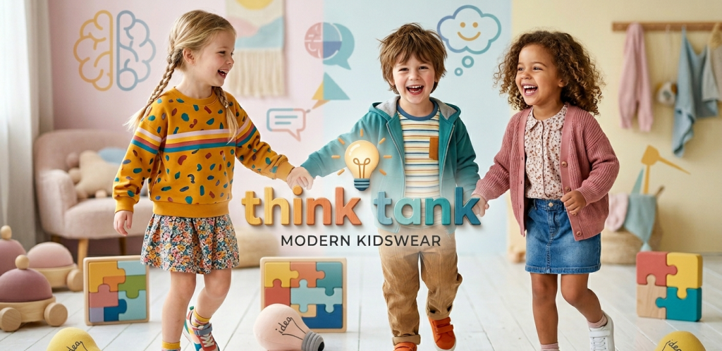
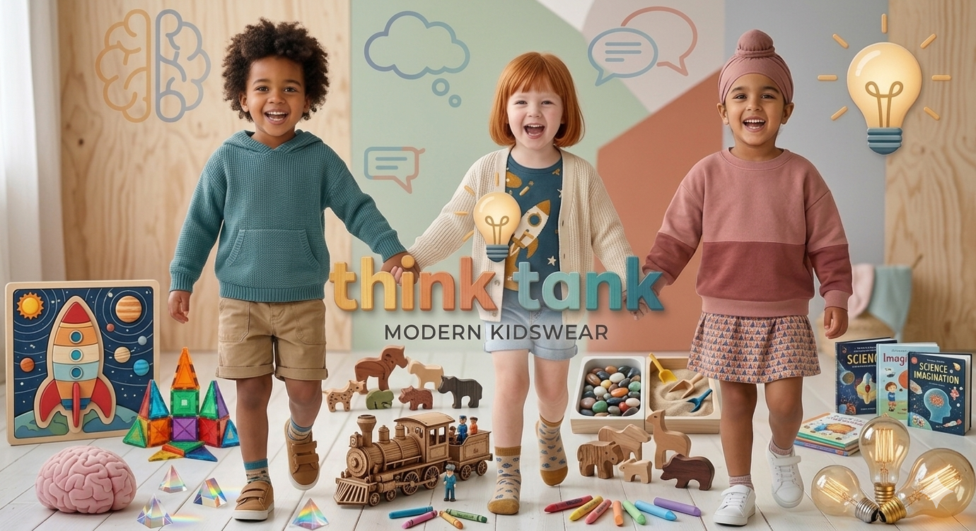
At Think Tank Egypt, we don’t look at visual identity as just a “logo design.” Instead, we see it as a complete system that creates the first impression in a mother’s mind even before she touches the product.
1. Visual Identity = Emotion Before Form
Kidswear branding is not only about beauty, but about the feeling it creates:
- Is the brand visually comforting?
- Does it communicate childhood joy and positivity?
- Does it give the mother confidence that the product is safe and premium?
A strong identity makes the mother feel that the brand is “close to her,” even before purchasing.
2. Color Selection: Not Just Beauty… It’s Psychology
Colors in kidswear are not random choices; they are a psychological message:
- Pastel tones: Create softness, calmness, and safety.
- Bright colors: Reflect energy, joy, and childhood spirit.
- Balanced combination: The secret to a brand that feels alive but not visually overwhelming.
In kidswear, colors must say: “I feel comfortable for your child and reassuring for you, Mom.”
3. The Logo: It Should Be “Told” Before It’s Seen
A successful kidswear logo is not just a nice shape; it is:
- Simple and easy to remember.
- Recognizable even without reading the name.
- Suitable for application on clothing (tags, labels, packaging).
A common mistake is overcomplicating the logo, while in reality, simplicity is what stays in memory for both mothers and children.
4. Typography: The Written Personality of the Brand
Typography defines the “personality” of the brand:
- Soft fonts = friendly and comforting brand.
- Bold and clear fonts = confident and strong brand.
- Unreadable fonts = loss of identity.
In kidswear, the goal is for the mother to read the brand name instantly without effort.
5. Visual Consistency: The Secret Behind Strong Brands
The biggest difference between a small brand and a strong brand is consistency:
- Same colors across all social media platforms.
- Same photography style.
- Same visual tone in packaging and advertisements.
A strong brand is one that makes people say: “I recognize this instantly.”
Conclusion: Visual Identity Is Not Decoration… It’s Trust
At Think Tank Egypt, we believe that visual identity in kidswear is the bridge between the product and the mother’s heart.
The goal is not just to look “beautiful,” but to be:
Comfortable, clear, and convincing from the very first moment.
Next Article:
How to build a “brand voice” in kidswear
(Tone of communication, captions, and how to speak to mothers in a way that builds real loyalty)